
visual language for a tea brand
Ayumi
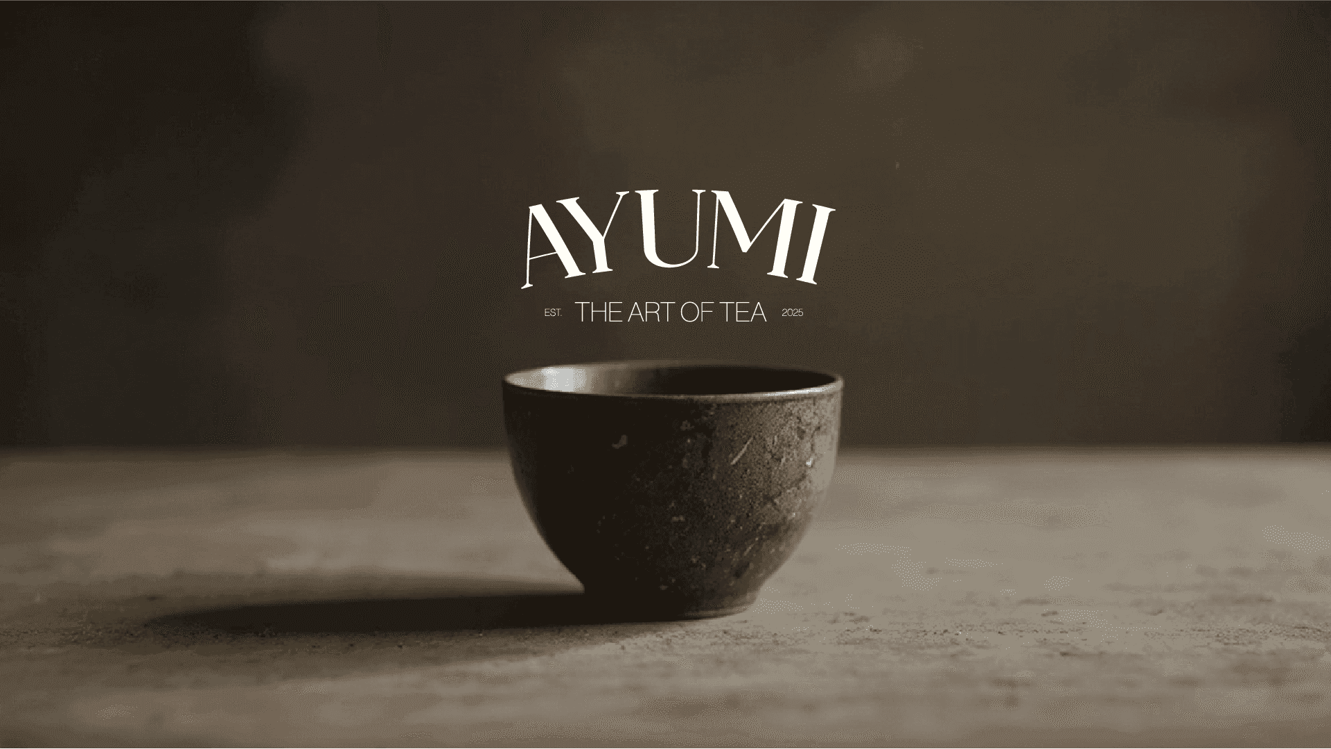
Ayumi is a tea brand that needed a visual language, not just a label: something that could live on packaging, in motion, and everywhere in between.
Visual LanguagePackagingBrand Graphics
the approach
tea is a quiet product, and the design had to be quiet too, without disappearing on a shelf. we drew a visual language that does more with less: type, rhythm, and a small system of graphic elements that recombine across packaging and motion without losing themselves.
the result
a flexible identity that works at every scale, from a single pouch to an animated campaign. calm on the surface, deliberate underneath, the way good tea is.